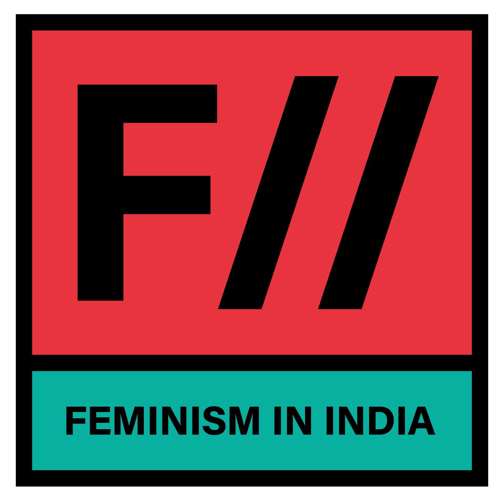
FII is changing its look, and we want to introduce you to our new logo!
You are familiar with our old logo, which we pushed out nearly 4 years ago, when FII had just made its foray into the world of digital activism, transitioning into a full-fledged website from a mere Facebook page.
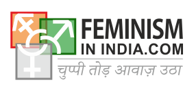
Since then, we’ve grown, and so have our advocacy efforts. Our ethos has been centred around feminist activism in the digital sphere, and we wanted our new brand identity to reflect our philosophy and politics better.
We got the fabulously talented feminist artist Kruttika Susarla on board to help us envision our new identity. (We’d been fans of her work for ages – see this interview where we featured her feminist lettering project nearly a year ago!)
After a couple of months of brainstorming and design, we finally have our new logo!

With this logo, we hope to represent a stronger and more cohesive visual identity. The colours are feistier and the typeface smoother. The most memorable aspect of the logo however, is the double slanting I in FII. The I’s mimic the // of URL addresses – http://feminisminindia.com/, for instance. The // represents the site of our activism – the internet – and our commitment to using the internet to advocate for feminist ideals and fight back against the patriarchy.
We are also debuting our new tagline!

It ain’t feminism if it ain’t intersectional, and this is something we have strongly believed in and tried to implement in our content. Discourse on intersectional feminism on the internet is often rooted in its American origins (it was coined by the African-American feminist scholar Kimberlé Crenshaw in a discussion on black feminism). We want to situate our intersectional feminism closer home, in India, with the multiple identity positions we occupy of caste, gender, sexuality, religion, disability and race. And so, FII is about intersectional feminism – desi style.
So there you have it! Our new brand identity. Tell us what you think in the comments below.
About the author(s)
Feminism In India is an award-winning digital intersectional feminist media organisation to learn, educate and develop a feminist sensibility and unravel the F-word among the youth in India.

Interestingly when I first saw the logo, the forward dashes reminded me of progressiveness and forward thinking. Also I like the simplicity of the design which I believe might serve well for the FII ethos and platform. Another fact I noticed was that you decided to do away with the Hindi tagline from your previous logo. This is a welcome step since our country is a melting point of various cultures and languages and a particular one cannot possibly signify the whole of the nation.
The role of graphic design in empowering movements and causes is quite important and it’s wonderful to see good graphic design behind the face of it! 🙂